Product DesignUX DesignMobile AppAI & AnalyticsDashboardFitness

Fitness Champion

Fitness Champion

Overview

Fitness Champion is a fitness assessment and recommendation system we built for independent gyms in India. The product targets a gap that has existed in the gym industry for years. Trial sessions at most gyms end with a verbal explanation, nothing written, nothing personalised, and nothing the potential member can take home and think about. Gym owners had no visibility into what their trainers were doing during trials, and trainers had no structured tool to make themselves look credible and professional. The result was low trial to membership conversion and a complete absence of data to diagnose why. We built Fitness Champion to replace that informal, unstructured experience with a system that gives trainers a structured assessment flow on their phone, generates a personalised AI powered report card for every trial member, and gives gym owners a desktop dashboard to review and share those cards with potential members via WhatsApp. The product works without any specialised equipment, integrates into how trainers and owners already work, and creates a leave behind document that keeps the gym in the potential member's mind long after they walk out the door.

Challenges and Strategy

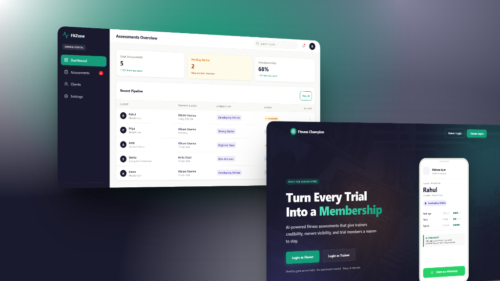
The first major challenge we faced was designing for two users whose needs pulled in completely opposite directions. The gym owner needed control and visibility. Every card that goes to a trial member carries the gym's reputation, and no owner wants a trainer making that call alone. At the same time the owner was already stretched across operations, sales, and floor management, and adding another task to their day was not an option. The solution was to design a system where control and efficiency lived in the same action. The owner sits at the centre of the share flow, reviewing every card before it reaches the member, which gives them full authority over what their gym communicates. But because the trainer has already done all the work of assessment and generation, the owner's job is a single tap. They see the card, they approve it, they share it. No data entry, no configuration, no coordination. The dashboard was designed around this principle, surfacing only what needs a decision and hiding everything that does not. The owner gets the control they were missing and the workload reduction they were looking for, built into the same interaction.

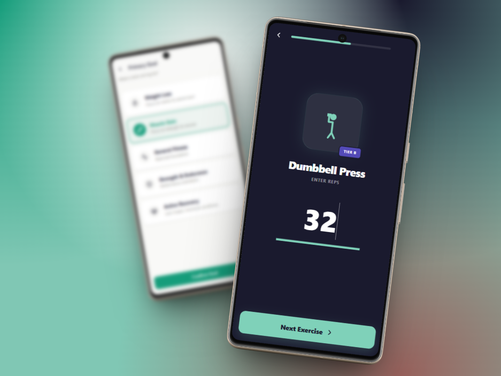
The second major challenge was designing the trainer side in a way that would actually get used. Trainers are on the gym floor, managing members, watching form, and keeping energy up. They are not sitting at a desk with time to learn software. Every extra field, every optional detail, every screen that required reading before acting was a reason to put the phone down and go back to doing things verbally. We designed the trainer flow around a single principle: one thing at a time, always. Each score input screen shows one exercise and nothing else. A single large number field, a one line instruction above it, and one button below it. No sidebar, no summary, no other exercises visible. The goal selection screen shows five large tappable cards with no sub-menus. When a goal is selected the system silently loads the right exercise set in the background without asking the trainer to configure anything. Every decision that could be made in advance was made in advance, so the trainer only ever sees what they need to act on right now. The result is a flow that a trainer with no prior training can complete in under three minutes without once feeling like they are using software.

Outcomes and Current Progress
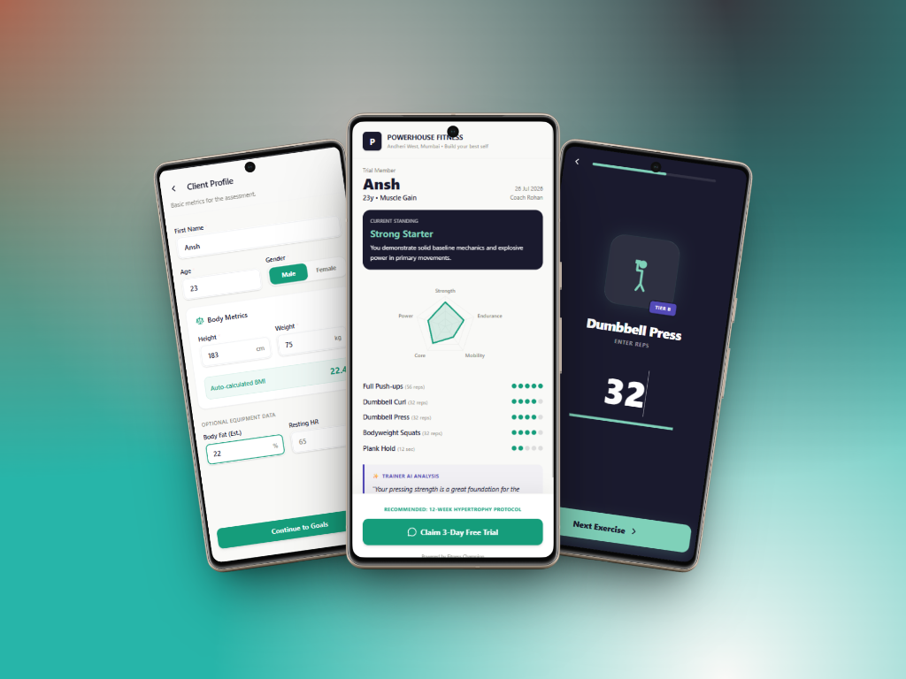
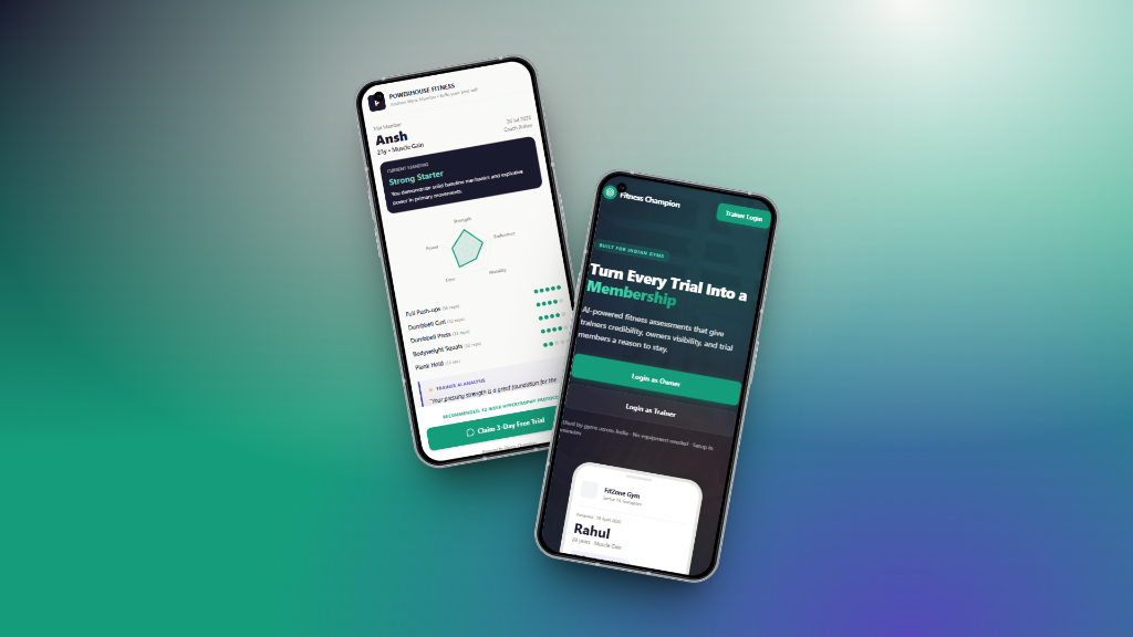
The product reached a fully clickable prototype stage covering the complete trainer flow across ten screens, a desktop owner dashboard with sidebar navigation and real time pending review management, a marketing led landing page with role based login, and a shareable client facing report card that requires no login to view. Every screen was built using a design system we defined from scratch, with a master prompt and PRD document that allowed us to move from design decisions directly into AI assisted prototyping without losing consistency across the product. The report card itself, with eight defined content zones including an AI generated recommendation, a motivational fitness tier, exercise scores with visual indicators, and a success story from a similar member, represents the core value the product delivers and the primary reason a trial member would choose to join the gym. The current focus is connecting the prototype to a live Supabase backend, integrating a real AI provider to replace the dummy recommendation text with genuinely personalised output, and preparing the product for its first pilot with three to five independent gyms in India. The transformation this product offers is straightforward. It takes a gym trial session that currently ends with nothing and turns it into a structured, professional, and personalised experience that gives the member something to take home, gives the trainer credibility, and gives the owner visibility, control, and data without adding to their workload. The mission is to bring a Cult.fit level trial experience to every independent gym in India without the expensive equipment, the enterprise software, or the complexity that makes tools like this inaccessible to the gyms that need them most.
Project detail 1
Project detail 2
Project banner

Have a similar project?

Start a Project